Typography (n): the style, arrangement, or appearance of printed letters on a page. And perhaps the design element of 2018.
The purpose of your site is to be read — and what you’re saying matters just as much as how you’re saying it. In 2018, text in web design continues to thrive under the helm of content-first design enthusiasts. We’ve rounded up the typography trends we’re seeing this year, many of which place text front and center — or, all over the page.
In 2006, Oliver Reichenstein published “Web Design is 95% Typography”, the second-most controversial artifact of that year — runner up to Borat. Reichenstein says, “Web design is not about picking great typefaces, it is how we use them.”
Let’s take a look at how we are using them.
1. Behold the bold hero
Big, bold, condensed, and unmistakably dramatic text is perhaps the most obvious use of text as a primary web design element. This year, we’re seeing hero images replaced by bold headlines that anchor homepages with brand names or messages.
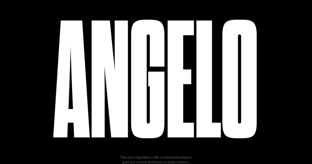
The effect? A site’s typography becomes the site’s design. CreativeDoc, for example, masterfully creates a loud design out of six bold, white letters on a strong black background.
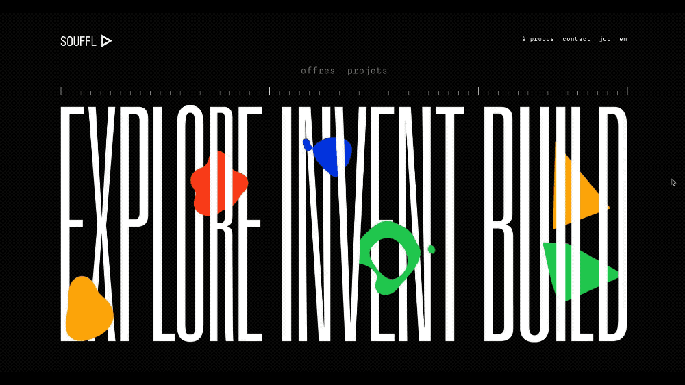
Souffl, a European design and innovation company, employs condensed, bold, white text on a black background, then adds character with pops of animated color.
2. Put your best foot forward
Serifs continue their footed rise to the top of the font kingdom since we first nodded to this trend earlier this year.
Elegant titles and sophisticated headlines outfitted in popular serif fonts like Calluna and Minion are warding off serif naysayers. So, what are designers doing with their newfound love for … feet?
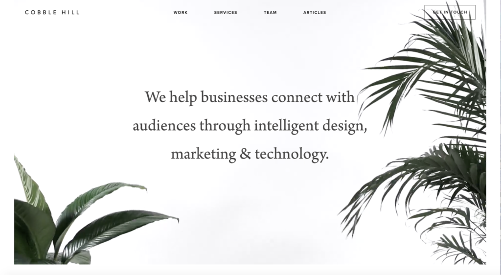
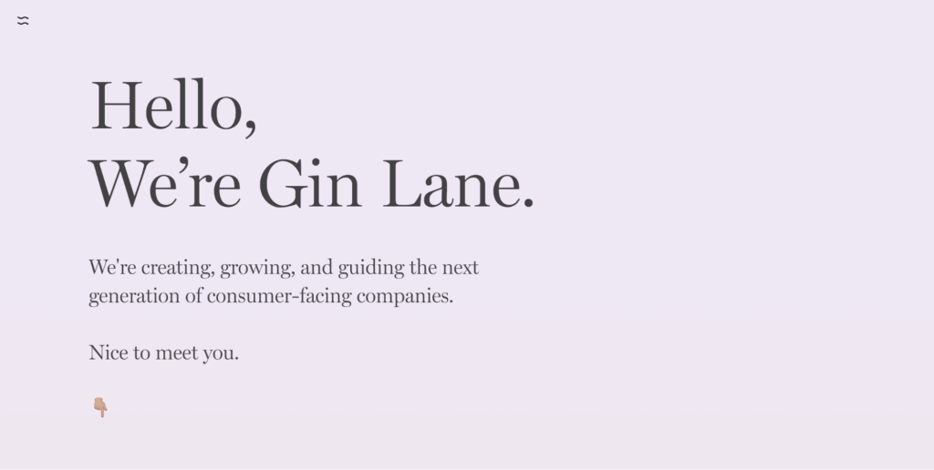
The designers behind Cobble Hill and Gin Lane are using them to infuse otherwise minimalist sites with a serif-induced elegance:
3. Captivate with plain ole text
The visual revolution that dominates journalism, among other industries, has yet to tarnish the importance and prominence of text in web design.
Justin Jackson’s site Words has been around for ages and it demonstrates how text alone can speak volumes on the web:
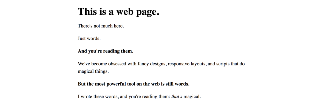
Now, in 2018, we’re seeing designers embrace words —what Jackson names the “most powerful tool on the web” — in their designs. It is no small feat to design a web page exclusively with text. But done well, we don’t even notice the lack of images.
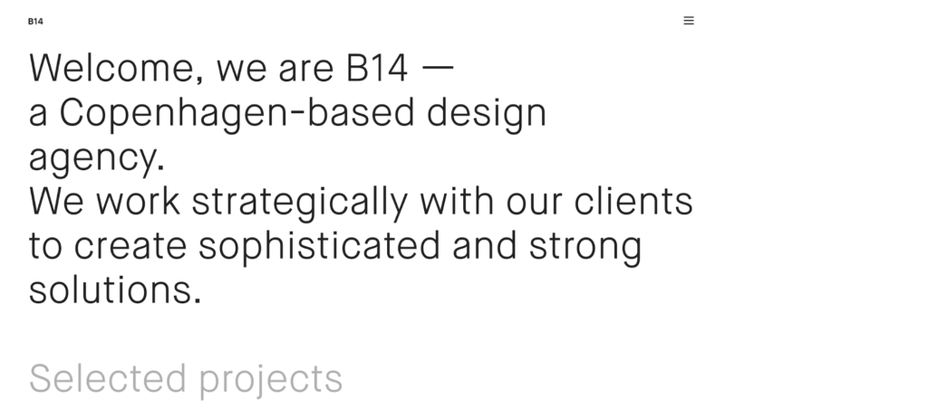
B14, a Copenhagen-based design agency, fills the real estate of its homepage with — gasp — words to show who they are and what they do:
Images may speak louder than words, but they don’t offer nearly as much control over what we hear.
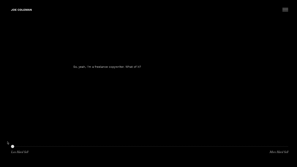
Joe Coleman, a freelance copywriter, hops on board the text-only train with a twist. The design features an interactive element that tells a story, and more importantly, captivates an audience in a way that visuals alone cannot:
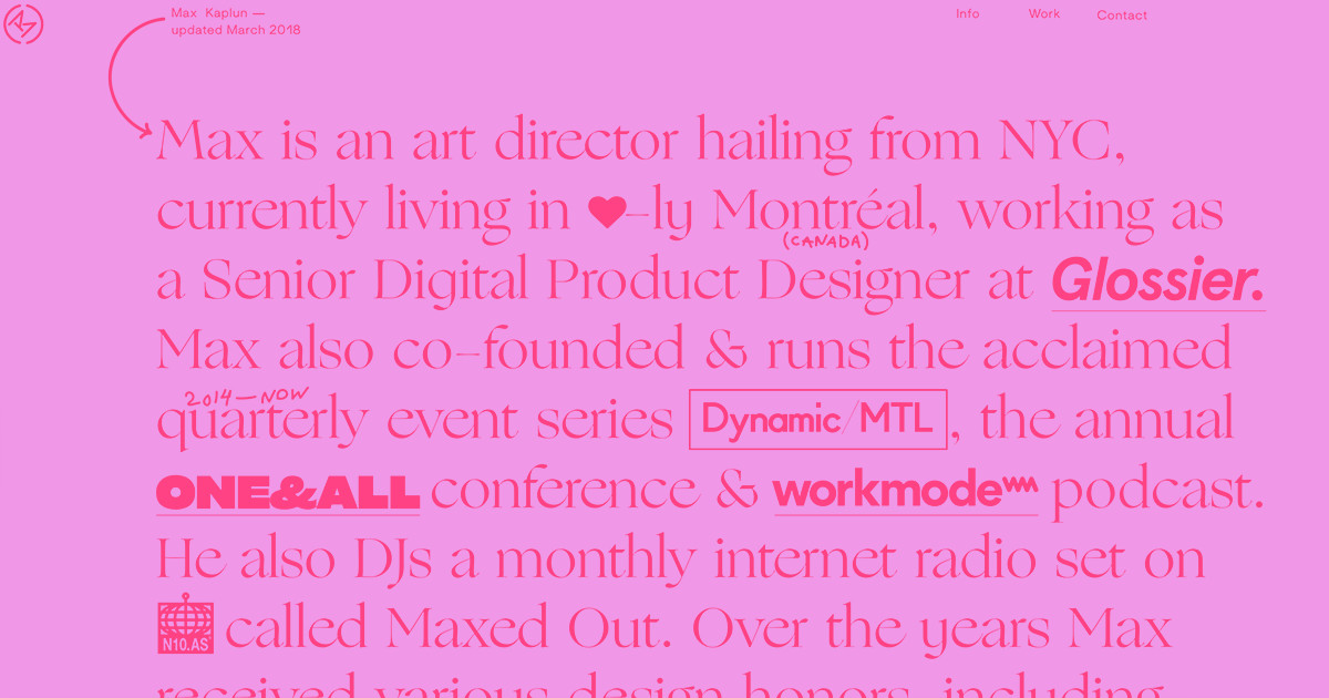
Max Kaplun’s portfolio confirms that not all heroes wear capes … some wear words. While text is the anchor of Max’s homepage, he supplements his words with symbols, variations in text size and weight, and a colorful cursor. Oh, and of course, a hover-activated headshot.

Design students get 50% off CMS site plans for 1 year
Because we believe in the power of (design) education.Get your discount

4. Make room for monospace
Monospaced typefaces have emerged not only in text-intensive settings with small point sizes, but as larger elements of a site’s design. The increased popularity of monospaced fonts has dovetailed the brutalist trend in web design as demonstrated in the examples below.
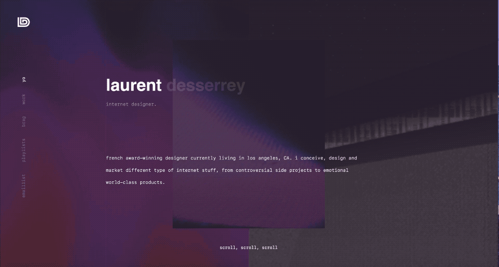
Laurent Desserrey designs a captivating portfolio that creates a memorable brutalist effect at the intersection of glitchy background images and monospaced type:
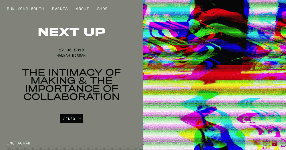
Run Your Mouth, a series of monthly talks in London, creates a similarly captivating brutalist effect with the use of monospace:
For more monospaced inspiration, check out the Top 10 Most Popular Monospaced Fontsby Typewolf.
5. Attention seek with highlighted text
Not every website comes with SparkNotes. Enter typography, whose function is to communicate and establish a hierarchy of content. This helps readers who skim and scan (i.e., most of us)stillget the gist.
Designers take a page right out of your elementary teacher’s book by adding colorful and well-designed highlights behind the most important messages on the page. But enough nightmares-of-your-middle-school-past — let’s see how designers use highlights to create a content hierarchy and add a pop of color:
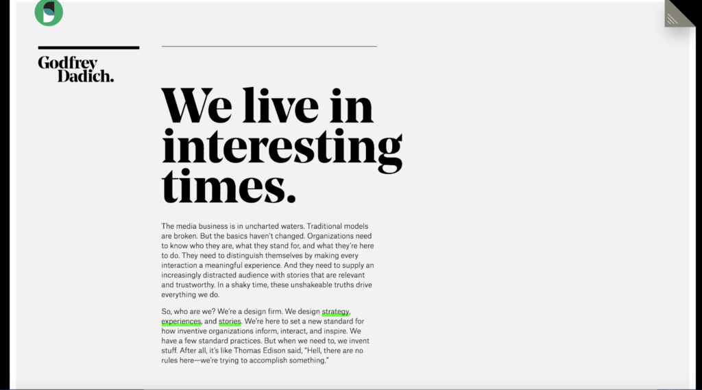
Godfrey Dadich, a design agency in San Francisco, creates a TL;DR aesthetic on their homepage with primary offerings highlighted in neon green:
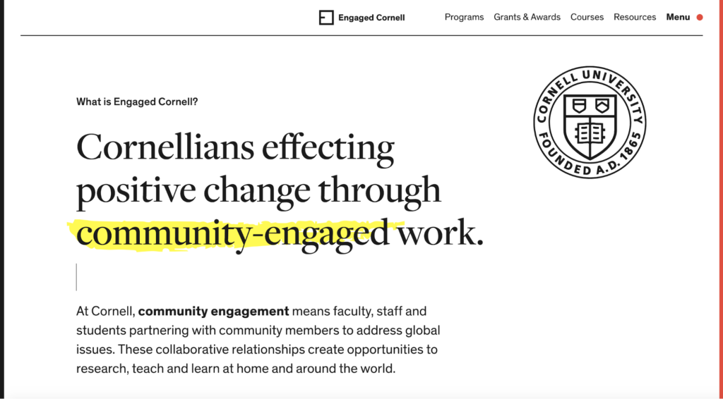
Cornell University also hops on the highlighter trend with Engaged Cornell. The neon-yellow highlights imply the presence of a reader engaging with the core text.
6. Turn heads with horizontal and vertical text
This typographic trend turns heads — literally. A mix of horizontal and vertical texts have emerged as a stylistic approach to breaking up blocks of text. The trend creates white space and elicits a wow effect by abandoning the age-old horizontal alignment.
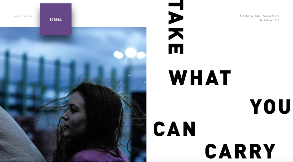
For example, the site for a film by Matt Porterfield, Take What You Can Carry, disrupts an otherwise horizontal text alignment with a single word:
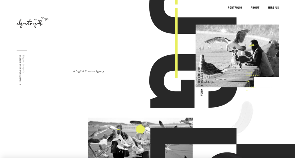
Other designers and agencies, such as Elegant Seagulls, experiment even further with vertical text alignment to create a sustained scrolling effect. Of course, important navigational elements remain horizontal for functionality:
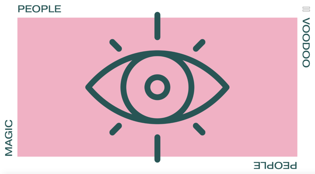
On the homepage for creative agency Magic People Voodoo People, the combination of vertical and horizontal text acts as a frame for the illustrative element at the center:
7. Scatter text — thoughtfully
Last, but certainly not least, we’re seeing a trend that may best be described as “my brain before coffee” — or, scattered text. If not deployed carefully, this trend borders on dysfunctional as it runs the risk of sacrificing both readability and accessibility.
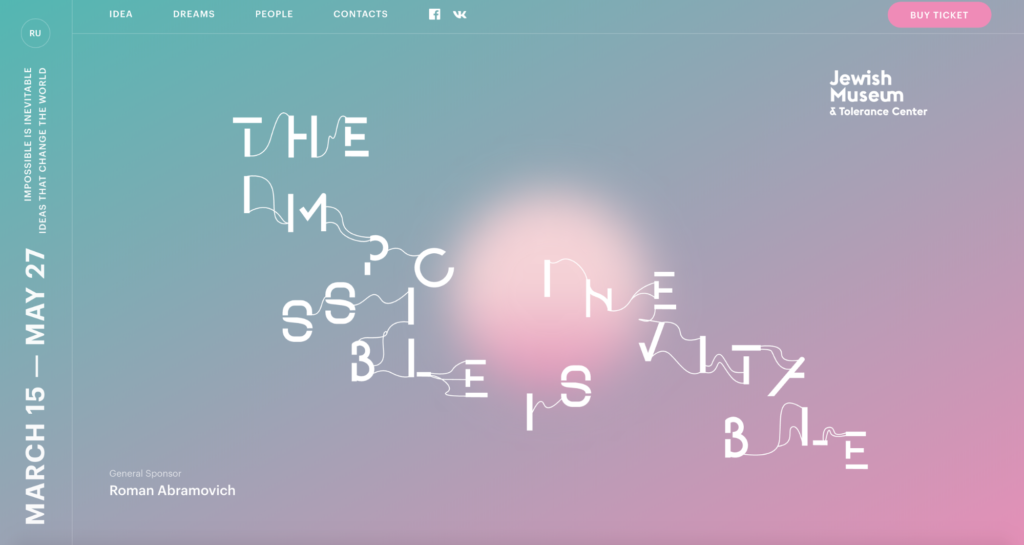
The Impossible Is Inevitable, an exhibition at Moscow’s Jewish Museum and Tolerance Center, presents its name in floating, strung-together letters on the homepage.
The exhibit’s title is by no means spelled out for visitors, but its intentional, scattered orientation of letters contributes to a larger meaning. Tiny threads weave the visually disparate letters together, mimicking the exhibit’s exploration of the unknown and our fragmented, fragile kinship with it.
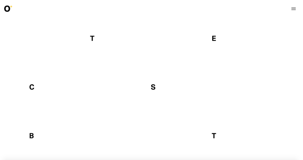
Octoplus Group, a communications agency, scatters letters to tell stories. The minimalist site is outfitted with small, bold letters that act as navigational elements. This is most fitting for a design agency dedicated to communicating brand messages and stories.
The evolution of typography is far from over as screen, font, and design technologies continue to advance. Like many nuanced trends in design, typography trends must maintain a high regard for accessibility, readability, and functionality.